The BTC Chart You Need To See – Its Way Earlier Then You Think
March 17, 2021 2:59 am Leave your thoughtsSince New Years, we have been seeing a steady incline in the price of BTC. Currently we are sitting at 56K USD and ALTs have seen initial inclines as they seem to be restoring. Things have been looking good, but there has been a lingering sentiment of question in the air. How high are we going? 100K? 200K?
When is TRUE ALT season going to start? And no IMHO ALT season has NOT started yet. We can see this in the BTC.D chart:
And the USDT.D chart:
I would consider the increase in ALTs just the beginning lead up, and with so many projects on the road to big releases and upgrades, I am anticipating next legs up in various projects.
Here’s the thing, there is one thing that many investors are not accounting for. Inflation.
The USA (and various other G20 countries) have printed a LOT of money. The USA alone has printed around 23% of all the money ever created, in 2021. And this is the crux. This changes things. This changes expectations and is inline with my longest term (and closely guarded) charts in BTC.
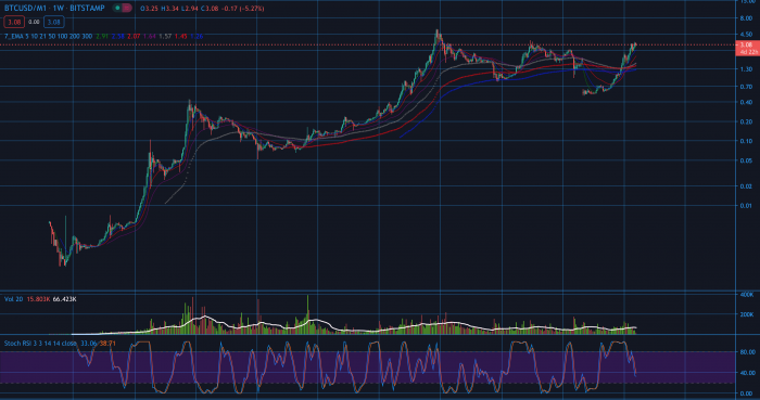
But lets go back to the first chart in this post…
What is this chart? This chart is the price of Bitcoin v USD with inflation removed.
Stop and thing about that again. Inflation has been so bad in the past while that the price of BTC is over 50K but with inflation removed from the chart we have not even pushed over the previous ATH. So technically the bull run has not even started yet all things considered. Which also means that ALT season definitely has not started yet.
In a previous post A Joe Biden Victory is Bullish for Cryptocurrency we discussed that a Biden victory would be bullish for crypto, and not for the reasons most people would think. Joe Biden’s policy is calling for the printing of more money so this will not be the end of this inflation.
Things are getting serious but as we examine this chart, we can clearly see that things are really just getting started.
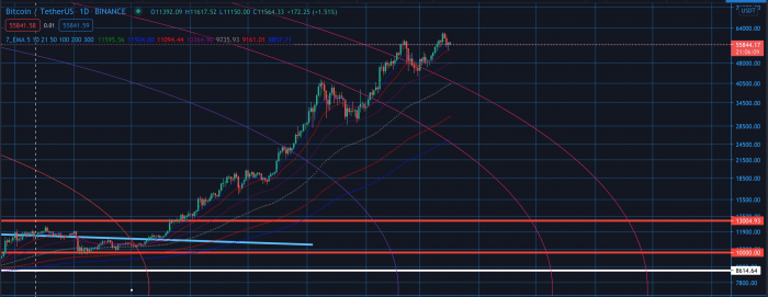
Where can things go from here?
We have some work to do here. We are clearly hitting resistance. As stated before, most people in the market think we are past the previous ATH but the reality is, we are not. I am still however bullish. We have retested support (green line) but the bulls will need to come in with some pressure to push us through the resistance band (yellow line). After which we will need to push through the actual ATH. If we fail we could see some movement to the down side but likely a higher low to build up some steam. With inflation like this, the fundamentals are just too strong IMHO.
What does this mean for the regular BTC/USD chart?
It means that the regular BTC/USD chart is exaggerated due to inflation. It would follow that an ATH of 100K per BTC is likely going to come faster than we thing and will NOT be the new ATH. The new ATH will likely be higher.
It also means that ALT season, when it actually hits will hit hard.
Be ready
Tags: BTC, BTC/M1Categorised in: Cryptocurrency Markets, Technical Analysis
This post was written by BlockAdvisor


